







I’ve been reworking the settings screen in Squarelets for weeks now, and on some level it’s annoying, because it’s just a settings screen, doesn’t impact the game much. At the same time, getting this right unlocks so much stability and velocity for the rest of the studio that I’m genuinely excited about it.
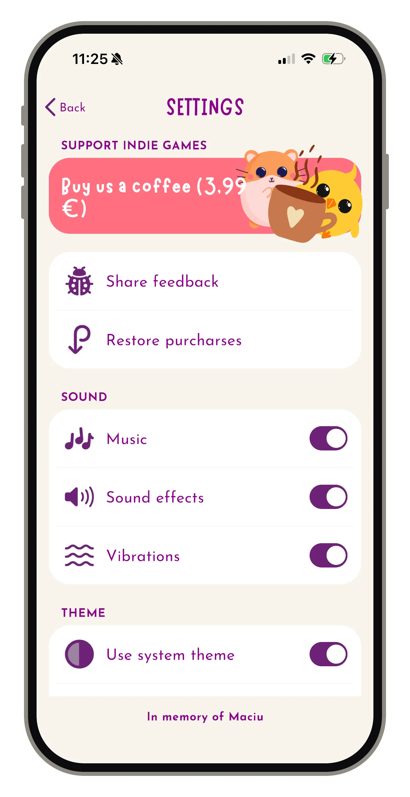
It was built to resemble the pre-iOS 26 default look, but it never looked quite right since migrating the game to Unity. It’s harsh on the eyes: contrast is too sharp, icons too big relative to the text and all the same colour, the whole thing unpolished.
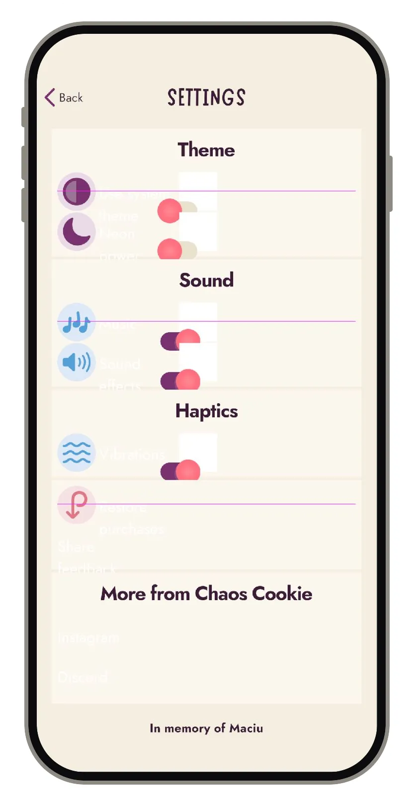
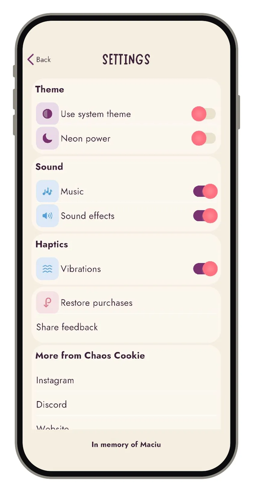
The screen is now code-driven end to end, which alone shaves off a lot of sneaky bugs and saves me headaches. My biggest bottleneck used to be wiring prefabs by hand: tedious, finicky and somehow I always got it wrong. The Unity editor makes it no fun for me at all. The breakthrough was realising I didn’t have to do this. I built myself a small prefab editing tool that does the dragging-references-around part for me, so I get to stay on the creative side of the screen going forward. Did this tool alone take another few weeks? Yes. Was it also discouraging while I was working on tooling instead of the game itself? Absolutely. But now that it’s done it already started paying off, saving me hours of time on other things I am working on. It also makes things much more stable. Before, some connections would sometimes disconnect, and it often took a long time to notice and fix it. That will no longer be an issue and I’m super happy about this!
Screenshots alone don’t show most of the work. Underneath the new surface, I changed most of how the UI is handled in the game and I learned a lot of quite low-level concepts. I reworked:
- how text is rendered, at different sizes in different languages and colourways
- how colours are managed (going back to the Google Material Design principles I used to work with daily and drifted away from)
- how sizing and rounding work, with deliberately restricted options so everything comes out coherent and polished without having to think about this
All of these will be their own separate posts as each was a really cool thing to nerd out on and I would like to share more of this. I like this new structure for its simplicity and its constraints at the same time. Creativity works best with constraints like these, because they save me from reinventing the wheel every time. So this is going back to the principles I already knew and cherished, but got a bit lost on the way.
And because it’s all code-driven, it’s resilient to prefab references going rogue (a battle I’ve fought forever, everywhere), much easier to test, and adapts to different screen sizes: tablets, PCs, TVs. Which means all my future games get these building blocks for free, and I get to spend my time on the game-specific parts instead.
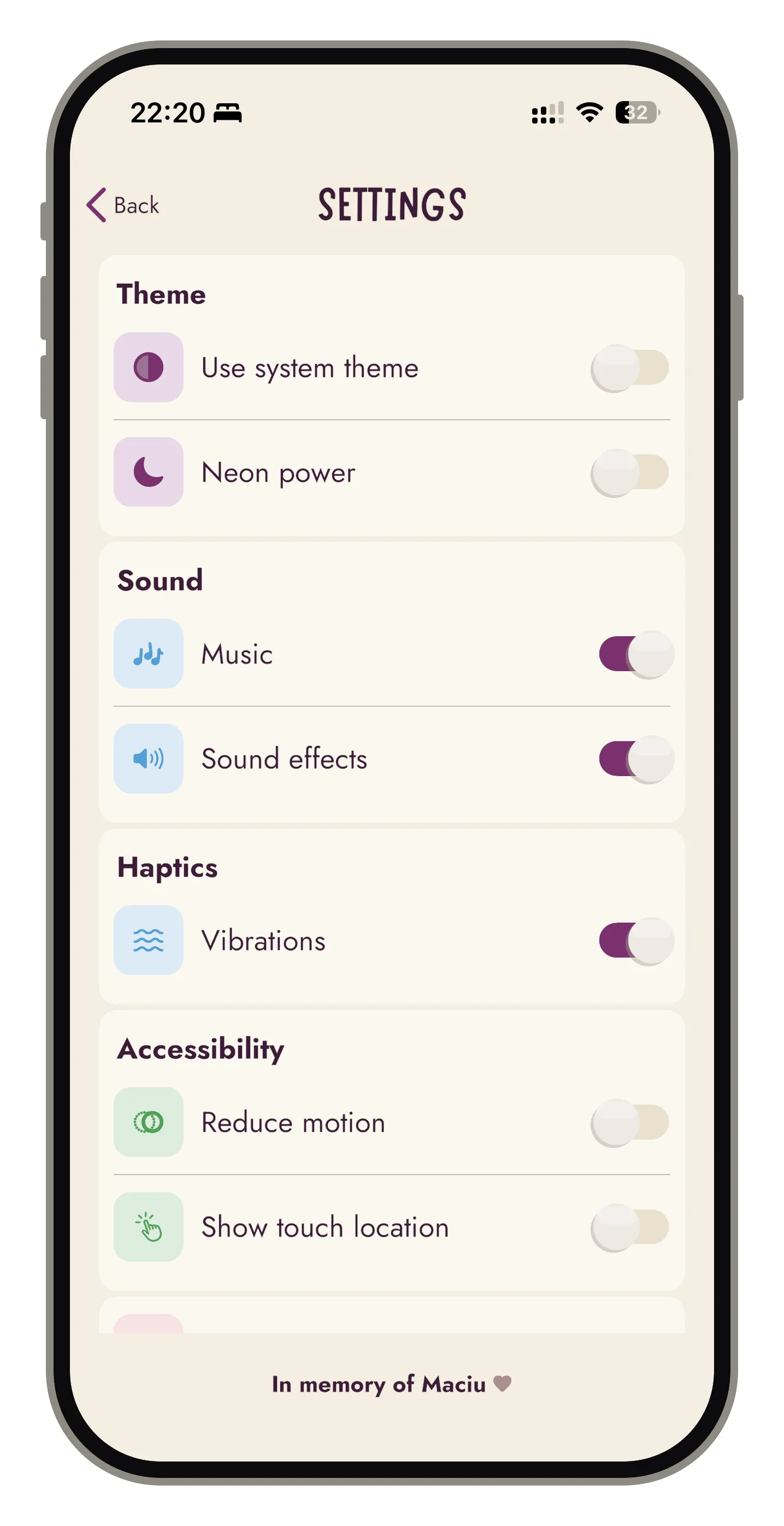
When I started with Unity two years ago, this was the wall I kept hitting. In native mobile development, navigation and UI components come basically for free. In Unity I started from an empty canvas and had to define every primitive myself: how fonts render, how a toggle works inside, how to make it pleasant in motion. It was slow and frankly quite annoying. But those primitives are now just here, in my own framework, and the process made me a better engineer: I know how the bricks are made, which is how you get to build walls.
Message me if you’d like to see more behind the scenes of how some of this got built. There will be more coming!